


The checkout conversion rate is the most important metric for ecommerce sellers. That’s the end goal of each ecommerce website: to make its visitors click the buy button and enter payment details.
Unfortunately this is not what most of them do: shopping cart abandonment at the checkout is commonplace.
How to stop losing sales when your visitor is so close to paying for your product? Check out these 10 practical tips on how to rock your ecommerce checkout conversion rates!
In our previous article Optimize your checkout page: ultimate sales maker in international ecommerce we discussed the importance of a straightforward, secure and localized checkout experience. In this article we’ll give you more practical tips.
After all, it is your checkout page that actually brings you money.
Put yourself in your customer’s shoes. What happens if you’ve just found a fantastic product online?
If you’re like most shoppers, you simply can’t wait to buy it!
And then .. bam! A landing page pops up that asks you to fill out dozens of form fields.
Still so excited about the product you were just about to grab? Tell people to wait to satisfy their desire and you’ll increase their resistance.
People prefer instant gratification to delayed gratification.
So this is one of the reasons why your checkout conversion rates can suffer.
Here are 10 tips that will help you enjoy more satisfactory sales figures!
Tip 1: Make the signup process less painful for online buyers
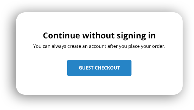
Asking the shopper to create an account can truly put them off. It takes time, but also … if you think everybody is over the moon at the prospect of receiving all those promotional emails and upsells from you … think again.
A mandatory sign-up? Not likely to help conversion rates!
Don’t push obligatory sign-ups onto your potential customers. 30% of users abandon their carts if they have to create an account before checkout.
Hence, you may be better off eliminating the obligatory signup and offer guest checkout. Alternatively, convenient registration options, such as logging in via Facebook or Google, can effectively increase conversion rates.
But I want them to sign up for my website!
… you may say.. We get it. But try to do it without interfering with the purchase process.
How to do this?
- Create a user account automatically when a purchase is made, assign a random password and email the information to the shopper with the order receipt.
- Encourage buyers to sign up on the Thank You page appearing after they’ve already purchased from you.
Tip 2: Calls to action on your ecommerce site must be 100% clear
You should never make the shopper confused. Never.
You must provide specific instructions, labels and guide the visitor to a clear call to action (CTA).
What’s obvious to you and your designer may not be so to less tech-savvy users.
CTAs, such as …
- Proceed
- Go
- Apply
- Back
… may not be too clear for many visitors. For instance, where do you actually go or proceed to? Forward? Back? To checkout? What do you apply?
Be specific about what you expect your buyers to do next. Better options may be Go to Checkout or Continue Shopping, depending on what you want your shopper to do.
Tip 3: Remove all distractions from your checkout page
Your checkout page is the page where you actually make money. You’ve made so much effort to land your visitors on this page…
Now.. to let them go or distract them is the last thing on your to-do list.
Amazon has learnt how to keep visitors focused by removing the navigation bar from the top. When you land on the checkout page, the menu is gone. The mandatory links to the Privacy Policy and Terms of Service are the only external links to be found there.

The bottom line …
The checkout page must be 100% distraction-free.
Don’t feel tempted to offer discounts or popups of any kind at this last stage of the purchasing process. Your goal is to end up with a finalized transaction.
Tip 4: Ask your visitor for essential information only
According to Forrester,11% of American adults abandoned a purchase online for either of the following two reasons:
- they didn’t want to register
- they were asked for too much information.
Every redundant field a customer must fill out can reduce your conversion. You really must make it simple and collect only the information necessary for finalizing the purchase.
Lean forms result in better conversion rates. Expedia VP deleted only one field Company Name in its checkout, which lead to an increase in profits of $ 12 million.
There are a few tricks you can use to make it easier for your visitors, for example:
- Pre-populate as many fields as possible.
- Offer a tickbox if billing and shipping addresses are the same.
- Place clear error messages near the error to save users from frustration and trying to figure out why they can’t proceed to the next page.
If you really need an extra field, such as a phone number, ask yourself if filling your database is worth losing sales.
In the case of some fields, add an explanation of why the field is necessary. Additionally, to increase the feeling of security, mention that customer information won’t be shared with third parties.
Tip 5: Experiment with single-page and multi-page ecommerce checkouts
A single or a multi-page checkout? There are many debates and no straightforward answer so why don’t you … experiment?
The single-page checkout process is shorter with all fields on the same page. It requires fewer clicks. Single-page checkouts work well if you sell impulse purchases or if your average order value is low.

Multi-page checkouts are more common in the case of purchases that require more thought or conducting product comparisons. The product also tends to be more expensive and/or complex.
Single-page checkouts may sound simple, short, sweet and inviting, but multi page checkouts have their advantages too. The signup process appears easier as each page requires small commitments.
If all data entry fields are squeezed onto one page, it may feel overwhelming and more of a drag to fill them out.
What will work for you best? Test the checkout waters!
A few general tips, though:
- Keep your checkout page de-cluttered and ask for essential user information only.
- Use smart forms that pull in information, such as a city or a state name.
- Use autofill forms to help users checkout faster, such as login via Google.
- Auto-detect credit card type, e.g. Visa, Mastercard, etc, on the basis of the card’s first four digits.
- If your products are digital, skip the postal address field.
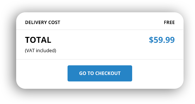
Tip 6: Offer free shipping, free returns and highlight secure payment
The guarantee that the payment and personal information is 100% secure is essential if you want the shopper to go ahead with the transaction.
Similarly, easy returns encourage visitors to make the purchase as they know that they can reverse a bad decision.
A hit is also a free shipping offer. According to Statista…
56% of online buyers leave without paying when faced with unexpected costs.
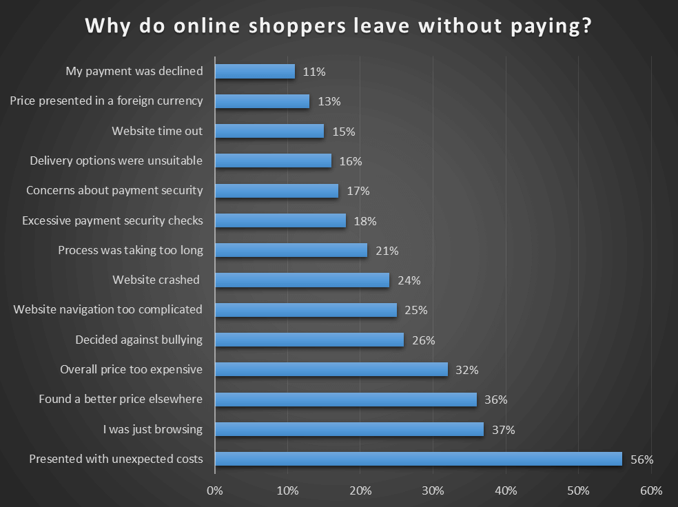
Source: WorldPay
Therefore consider adding shipping costs to the product price and offer your potential shopper the free shipping option.

From the customer’s perspective, it looks like your business covers shipping costs for them. So why not advertise We’ll pay your shipping.
See for yourself how powerful this psychological trick is.
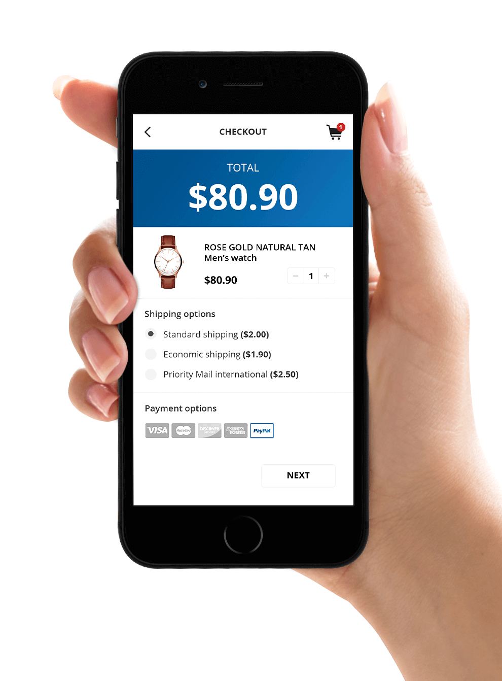
Tip 7: Consider using mobile-first design of your ecommerce site
The number of smartphone users is on the increase. Think how much traffic comes through mobiles nowadays. And still … many retailers haven’t adapted their marketing and mobile design of their ecommerce sites.
No doubts: your website must be mobile-optimized.
Your form must work well on smaller screens:
- Use larger, tappable buttons.
- Make navigation easier by vertically aligning form fields.
- Remove menus.
- Remove complicated multi-step checkouts.
- Set up your checkout so that the right keyboard appears for each of the fields, e.g. if a phone number needs to be entered, display the number keyboard.
- Use the phone’s native date selection UI.
- Maximize the form’s loading speed on mobile by minimizing the number of images.
- Request payment information in the last field to avoid customer apprehensions.
Tip 8: Retarget your visitors
Imagine 100 shoppers visit your store. Over 95% of them bounce off without making a purchase. Yes, this number is in line with average conversion rates for ecommerce stores, which is about 3% globally.
However, the ones who have left are already familiar with your brand and offer. Some of them may have been this close to buying your product before abandoning the cart.
Is it easier to sell to people who are already familiar with your website/product as opposed to complete strangers? You bet!
So retarget the 95% who have left your site without buying.
You can do it with advertising by adding a pixel or a Javascript tag to your site. This way you can track non-purchasing users across the web. When these users search for keywords similar to yours, they will see your banner or PPC.
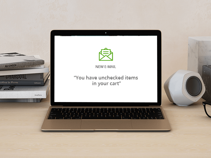
You can also carry out retargeting via email, similarly by adding a pixel to your site to track visitors across the web. This time, however, you won’t target them with ads, but an email reminder, for example saying You have unchecked items in your cart.
Numerous studies confirm the effectiveness of retargeting methods. Your customer acquisition rates are also lower and chances of conversion higher due to the familiarity with your brand.
Yes, retargeting works. You may be stunned by the difference in your conversion rates.
Tip 9: Set up shopping cart recovery emails
Sometimes all it takes to convert abandoning visitors is a gentle nudge. And shopping cart recovery emails may help.
Shopping cart recovery emails are typically sent after visitors have added products to their carts, but abandoned the checkout process. They’re sent to leads that are still warm and remember your brand/product, so usually 1-3 hours after the abandonment. It usually takes longer if your product requires more research on the customer’s side.
These emails are reminders that there are items in the customer’s shopping cart. They can also emphasize various benefits you offer, e.g. free shipping, discounts or coupon codes.
Studies suggest shopping cart recovery emails are exceptionally effective.
Their opening rates are high, amounting to even 50%, 1 out of 8 such emails is clicked. A third of these clicks lead to a sale.
Tip 10: Use some psychological cues and make your price .. smaller
According to a Cornell study, shoppers respond better to prices listed without dollar signs.
You can also experiment with the size of the font you use to present a price. Some studies suggest that if the price looks small on the screen, the product may seem cheaper.
In other words, make your price appear insignificant, especially at the very point of purchase.
Avoid drawing attention to the price in your checkout
Selling internationally? Localize your international checkout!
UK buyers pay in pounds and Germans pay in euros. Brits’ favourite online payment methods include credit cards, debit cards and Paypal. Many Germans prefer to pay by invoice.
Here’s the deal…
Buyers from different countries have various checkout expectations and preferences.
If you don’t provide the payment option the shopper is familiar with and expects, you may put them off. If they don’t see the price in their currency, they may not bother to use a currency converter and will move on without completing the purchase.
If they don’t see the shipping option they’re after, they’re likely to leave too.
Glopal’s Localized Checkout is a tool that gives your foreign customers that little extra help and a little push during the checkout moment.
Your international customers will benefit from the localization, international shipping options and currency conversion.They will be offered a possibility to finalize their purchase in their language, their currency and with a suitable international shipping method.
This will be provided as an optional choice for your buyers: if they wish to proceed at your domestic store checkout, they can still do that.

What does it mean?
More convenience and options for your international buyers and increased checkout conversion rates for you!
According to our extensive trialling and testing…
Stores using the Localized Checkout feature see their international sales grow by an average of 26%.
To find out more, contact us at sales@glopal.com
In a nutshell
Persuasion doesn’t end when your visitor makes a decision to click the Add to Cart button.
To a large extent, it will be your checkout page that will determine your conversion rate success. Any web design problems, complicated, unclear processes or redundant fields are likely to drive your potential customers away.
The lack of consideration for your international buyers will lead to lost money too.
But it doesn’t have to be the case and you can take matters into your own hands