For ecommerce sellers, the conversion rate at the checkout is the ultimate metric. Well… this page actually brings you money. Even a seemingly insignificant 1% increase in the checkout conversion rate can add some real money to your business.
Hence, optimize your checkout page and don’t forget to pay special attention to your international buyers.
Read up on what you can do to improve the most significant ecommerce metric and enjoy your new sales figures on both your domestic and international markets!
Imagine this situation. A customer comes across your product. They like it, they really do, and are ready to part with their cash to get it. So they put the item into the shopping cart.
Your job should be done, right?
Far from it! Here comes the checkout process: time for the buyer to:
- fill in shipping and payment information
- add discount codes (if any)
- confirm the order
- … and make the payment.
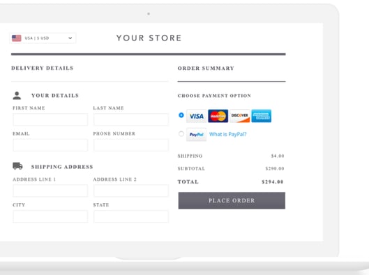
Quite a few steps before you get the license to ship your product, right?
But one thing is certain: you must ensure your checkout process is safe, fast and easy.
No unnecessary questions, or anything that could cause doubts or distress. It all has to go smoothly. Remember to include different shipping options. Account for the individual preferences of the buyers from the countries you sell to, such as payment options.
Otherwise, the cash the buyer has been so willing to spend may never land in your account.
The good news is …
… it’s within your power to increase your conversion rates by ensuring a better checkout flow and design.
Shopping cart abandonment: a challenge for local and global ecommerce
When buyers put items in a cart but don’t finalize the purchase, the shopping cart is abandoned.

According to Baymard Institute, the average shopping cart abandonment rate approximates 70%.
70% is a lot. If 100 customers put items in their carts, only 30 will actually buy the product. The odds aren’t even 50-50.
Why is that so?
Your potential customer may be totally interested in your product. They may be happy to purchase it, even from a different part of the world. The only reason stopping them from finalizing the purchase may be … distractions.
A Faceboook notification can pop up, a friend may call or the Internet connection can be disrupted. None of this has been caused by you, but still…
… the ‘buy now’ magic moment is gone!
Four out of five notifications from friends will be more important to consumers than 50-dollar shoes.
If the purchasing process isn’t straightforward and inviting, notifications and other distractions will almost always win.
Sometimes there’s not much you can do in the face of the super short attention span we have today. There’s a lot of information, a myriad of attention-grabbers, plenty of choice. Staying focused has become a bit of a challenge.
All the same, your task is to strive towards a checkout process that will be quick and user-friendly so that you minimize the risk of shoppers going somewhere else.
Your task is also to accommodate your international customers as they’re likely to expect a different checkout experience than the one typical of your domestic market.
Reasons why ecommerce transactions don’t get finalized
Sometimes users visit ecommerce websites with no (initial) intention to buy products. They may browse websites for the following reasons:
- window shopping
- price comparison
- finding ideas for gifts
- saving items for later.
Or they may be .. just browsing and/or … killing time.
But there are also users who want to do some online shopping. In fact they’ve already placed items in the shopping cart, yet … something goes wrong.
Why doesn’t the checkout process get finalized?
- The final price is too high.
- Unexpected costs, e.g. shipping costs, come up.
- The checkout process is too complicated or not straightforward.
- Security concerns arise, especially when it comes to payment.
- There’s account creation problem.
- There are not enough delivery options.
- Payment methods popular in a given country are not available.
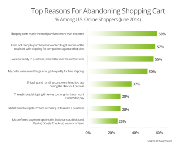
There are a few potential obstacles, but your task is to …
Improve the conversion rate for your checkout pages.
Optimize the shopping cart experience, also for international buyers
For many shoppers the checkout process may be too complicated or take too long. One of the reasons may be too many fields to fill in.
According to Baymard Institute, on average the US checkout flow includes 23.48 form elements displayed to users by default. An ideal checkout flow can contain as few as 12-14 form elements.
The truth is that many sellers can reduce the number of form elements displayed to shoppers by 20-60%.
The question is: do you really need all those fields filled out?
If you think that one extra field can’t do any harm … it may.
Go through your form elements and make it as easy as possible for your users, asking for necessary information only.
It’s worth making an extra effort to optimize the shopping cart experience. Making small changes can translate into a lot of extra revenue in your pocket. But how can you do it?
Here are some examples:
- Make it clear to customers that they’ve added an item to the cart and give them an option to proceed to checkout at all times. No shopper should have doubts about what has just happened.
- Give your shoppers the options to Buy Immediately OR Continue Shopping: take into account customers’ individual shopping journeys.
- Remember your user’s choices even if they abandon their shopping carts. If they come back, their earlier cart will be there for them, which will make them feel attended to.
Optimize your shipping
One of the reasons why shopping carts are abandoned is the lack of a desired delivery option.
If the buyer expects the lowest price, they tend to go for a standard untracked postage. If the buyer wants the order delivered urgently, they’ll be after a same-day or express delivery. Buyer needs may vary from country to country.
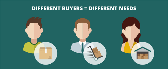
Hence, optimize your shipping and think of offering multiple delivery options. According to Adrien Salvat, expert in international shipping, optimizing your shipping can be a real deal maker.
Your shipping offer should address various buyer expectations. According to Glopal’s tests, online sellers who offer multiple delivery options grow their active GMV by 14%.
Hence, to increase conversion rates, Glopal offers its clients the possibility to apply competitive delivery options in addition to the seller’s ones.
Currencies and payment methods
Another important aspect is related to the payment methods you offer at the checkout. The rule of thumb: different countries mean different preferences.
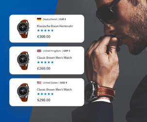
For instance, Brits’ favourite payment methods include credit cards, debit cards and Paypal. On the other hand, one of the top online payment methods for Germans is per invoice. If you don’t give them this payment option, you may put off all those buyers who are used to paying this way.
Further, don’t forget currencies. After all, UK buyers pay in pounds and Germans pay in euros.
If you don’t provide prices in local currencies and make your potential buyer go to a currency converter … oh well …
… you’re distracting your visitor from the checkout process yourself.
Understand the online buyer: remove their uncertainty
.. otherwise your conversion rates are in danger.
It’s crucial to let your visitors know what’s coming next. Don’t make them wary about what happens if they (accidentally) click on the ‘next’ button.
Let the user know how long the checkout process will take. Motivate the buyer by giving them a sense of progress, especially in the case of a multi-page checkout process.
For example ASOS uses a progress bar. Not only does the shopper know where they are with the purchase, but they also see they’re moving towards the completion of the checkout process.
Another point not to be forgotten … shoppers find it easier to finalize their purchase if they feel that you’ve taken care of any potential risks.
For instance, if they don’t like your product, let them return it. Remember to let them know they can do that in a hassle-free way, e.g. by displaying a guarantee or a refund policy on your website.
Showing you’ve thought about any potential risks and you know how to address them, your (future) customers will love ordering from you!
And obviously .. security. Some website users, especially those who are less tech-savvy, may not be that concerned about security. Until the moment they’re about to … part with their money and enter their credit card details.
To increase the chances of closing a deal on the checkout page, you can add two important assurances near the critical credit card fields: security and a money-back guarantee.
Positioning secure logos next to the credit card fields provides users with the extra assurance they need at that important checkout moment.
Tackling the buyer’s psychological resistance has the potential to solve a lot of your checkout friction.
Use a bit of urgency: remind buyers why they should take action NOW
Sometimes you need to give almost-buyers a bit of a nudge. This gentle push that will make them think: I don’t want to miss this deal!
When people are browsing, they may be really interested in a product that they’ve come across. All the same, they may feel no pressure to finalize the purchase, thinking they can come back and buy the item later.
They’re not super motivated to take action now, and later on … they forget.
To push some of those in the ‘just browsing mode’ into the ‘buying mode’, inject some urgency into your checkout process. For example, when people see there’s only one item left and your stock level is limited, they’re much less likely to wait another day!
The fear of missing out on a good deal is pretty daunting. And people like.. instant gratification.
Glopal’s Localized Checkout
And let’s stress again: remember your international buyers!
Glopal’s Localized Checkout is a great tool that gives your international customers that little extra help and a little push at the checkout.
Your international buyers will benefit from the localization, currency conversion and international shipping options powered by Glopal. They will be offered a possibility to complete their purchase in their language, their currency and with a suitable international shipping method.
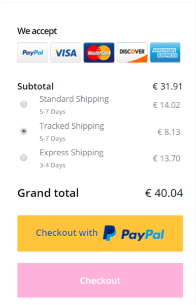
This will be provided as an optional choice for your customers: if they wish to proceed at your domestic store checkout, they can still do so.
What’s in it for you? Increased checkout conversion rates!
On the basis of extensive trialling and testing…
Those stores using the Localized Checkout feature saw their international sales grow by an average of 26%.
In a nutshell
The main message from this article is simple.
Abandoned shopping carts = lost money
For many online sellers this could be a pretty painful realization should they calculate how much money they have lost by not making enough effort to ensure a smooth checkout flow.
Especially as small changes can mean big rewards.
Luckily, it’s never too late to optimize your shopping cart so don’t put off investigating whether you are doing it right or … whether there’s room for improvement. Especially if you sell on foreign markets.
Give your buyers a localized checkout experience and watch your checkout conversion rates grow!


